
10 Timeless Paint Colors That Look Perfect on Lake Houses
Nordic Painting shares expert insights on exterior colors that bring out the beauty of waterfront homes in any setting.
Whether you're perched above a quiet inlet or facing a sprawling lakeshore view, your lake home deserves a color palette that complements its natural surroundings while standing up to the elements. At Nordic Painting, we’ve worked with hundreds of lakefront homeowners and vacation property investors. We've seen firsthand how the right paint color not only elevates curb appeal but also extends the life and value of a property.
Here’s a curated list of 10 timeless paint colors that consistently deliver elegance, durability, and that quintessential “lake house” feel.
1. Coastal White
A perennial favorite, crisp white paint offers a fresh, clean aesthetic that reflects light beautifully—ideal for homes that get full sun exposure off the lake. White can modernize older homes or highlight architectural charm on cottages and bungalows. It also creates contrast with dark shutters, metal roofing, or natural stone.
Expert tip: Use white with semi-gloss trim and matte body for a subtle yet dynamic finish that resists glare and mildew.
2. Slate Gray
Elegant and grounded, slate gray is a go-to for homeowners who want a modern but not cold appearance. This mid-tone gray works well with both cool and warm accents, making it versatile for various trim colors or landscaping.
Perfect for: Homes with sharp roof lines, modern siding, or a blend of wood and metal elements.
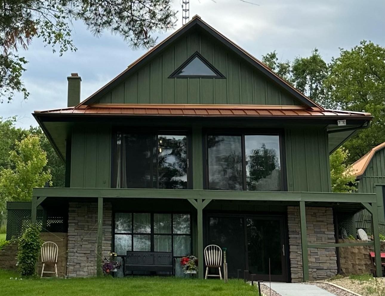
3. Sage Green
Inspired by pine needles and mossy lakebanks, sage green is nature’s neutral. It helps homes blend into forested surroundings while still standing out as refined and intentional. It ages gracefully and performs well under overcast skies or shaded lots.
Color pairing: Combine with cream or light tan trim to keep it soft, or rich espresso brown for contrast.
4. Sand Beige
There’s a reason this neutral shows up on both beach cottages and mountain homes—it’s warm, calming, and adaptable. Sand beige doesn't compete with the natural surroundings and looks great in both summer and winter, sun and shadow.
Great for: Year-round homes or rental cabins where versatility and subtlety are key.
5. Navy Blue
If you're going for classic, coastal, and stately all at once, navy delivers. This deep blue evokes nautical themes without becoming overly thematic. Against white trim and metal fixtures, navy projects confidence and curb appeal.
Maintenance note: Use fade-resistant paints, as darker shades can age more noticeably on high-UV-exposed walls.
6. Muted Taupe
More nuanced than beige, taupe leans slightly into gray or even purple undertones depending on the light. This chameleon-like color is ideal for homes that need to “play nice” with stone foundations, brick chimneys, or composite decking.
Ideal for: Transitional styles or lakeside homes with mixed materials and mature landscaping.
7. Pale Blue
Light and breezy, pale blue creates an airy, open feeling that reflects sky and water—especially in morning and late-day light. It’s often used to help small or shaded homes feel bigger and brighter.
Suggested use: Works well with white railings, natural wood decks, and board-and-batten siding styles.
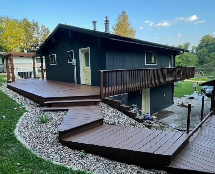
8. Charcoal Black
For homeowners looking to make a dramatic architectural statement, charcoal is a bold yet tasteful option. It creates an ultra-modern aesthetic and contrasts beautifully with wood grain, river rock, or metal paneling.
Consider this for: Scandinavian-inspired cabins, A-frame homes, or minimalist structures.
9. Driftwood Gray
With subtle brown and green undertones, driftwood gray mimics the color of sun-aged timber—a perfect nod to the lakeshore aesthetic. It creates a cohesive look when paired with natural landscaping, dock features, and reclaimed wood.
Finishing tip: Use matte or low-luster finishes to enhance the organic texture of the color.
10. Buttercream Yellow
This shade is warm, nostalgic, and cheerful without being overpowering. Buttercream yellow adds personality and visibility—perfect for vacation homes that you want to feel welcoming to guests or renters.
Best with: White or soft gray trim, and classic porch railings.
Why Paint Color Matters More at the Lake
Lakefront properties face more intense environmental challenges than inland homes: elevated humidity, direct sun reflection off the water, temperature shifts, and wind exposure. That’s why choosing the right paint type and color isn’t just about aesthetics—it’s about protection, longevity, and investment value.
Color can also define how a home feels. Calming hues make a getaway home more relaxing. Rich neutrals give permanence to year-round homes. And light-reflective shades help combat the overcast or shaded environments typical in wooded lots.
Nordic Painting Knows Lake Homes
At Nordic Painting, we don’t just pick colors—we help create moods, preserve materials, and protect your investment. With years of hands-on experience painting homes along lakes and rivers, we know what works. From premium fade-resistant coatings to moisture-fighting primers, every layer we apply is informed by location-specific knowledge.
Call Nordic Painting today to schedule a consultation. Whether you need a full exterior repaint, a lakeside color consultation, or a fresh look before summer rentals begin, we’re ready to help your home look its best—season after season.
Let’s turn your lake home into a timeless classic.